Full Scale Product Design
Met MuseumAudio Tour App
As part of my course work in the Google Coursera UX/UI Design Course, I was tasked with creating an audio tour app for an art gallery. Over the next 3 months, I worked to research, design, and test the app using Figma and in-person user testing.
NOTE this was created for a class assignment as does not reflect the views, values, or vision of the Metropolitan Museum of Art.

Step 1: Research
I was given the prompt to create an audio guide app for a local business, and I chose the Metropolitan Museum of Art (The MET) as they currently do not have a mobile app. From there I made concrete decisions on my overall goal with this product, including my target audience and success criteria to guide my designs.

With this in mind, I conducted user research by looking at the museum's attendance numbers throughout the years and by going to the museum myself and noticing the general audience.
Looking at the attendance data from the MET for the past 3 years, you can see that visitors come from all over the world, and vary widely in age. Since the museum is one of the main tourist attractions, visitors are just as likely to be visiting from a foreign country as they are to be locals.
There is a core group of frequently returning visitors, which the museum is looking to expand. Returning visitors tend to be either students or locals. Within this core group, there are 3 major pain points.
While the museum does currently offer in-person tours, they run on a strict schedule and are not accessible for people who are hard of hearing or speak a non-English language.
3. Engagement
Visitors have reported that participating in more educational events during their stay at the museum makes them more likely to return.
Key Findings
1. Overwhelming
Visitors report a feeling of being overwhelmed by the museum’s offerings and being unsure where to begin.
2. Convenience
To further narrow my focus and ensure I'm creating solutions to real-world problems, I created two user personas to guide my designs.
Persona 1: Jackson

"I want to experience everything this city has to offer!"
Jackson is a 30 year old man living in New York City with his partner. He liked to look for fun and unexpected things to do in the city and would make for a good date night activity. He wouldn't call himself "artistic", but he has a passing interest in it.
Museums can often feel overwhelming for him due to their size and the lack of context Jackson feels he has. When he lookes at art, he worries if he's "getting it" or not, but really enjoys the murals in his neighborhood and has bought a print from an artist friend before for his apartment.
Persona 2: Lisa

"Every day is a chance to learn something new!"
Lisa is a lifelong lover of all things "art". As a native New Yorker, she loves to take advantage of all of the galleries and museums the city has to offer, and will go to museums in other cities when traveling as well. As she's gotten older, her eyesight is getting worse and it is difficult to read smaller text. She has an active friend group who craft together and sometimes sell her creations at local art fairs for fun.
Step 2: Wire-framing
Before any pixels can be placed, I picked up a pen and piece of paper and sketched out rough ideas for wireframes and user flows. This helped me see that some of my initial ideas exceeded the scope of the project, and helped me focus on the main goal of providing an audio tour app for the market.

With this basic frame work in mind, I then turned to Figma and began laying out a very basic wireframe for my app. This helped me make decisions on how many pages I wanted for my app, the general user flow, and the information structure.

Accessibility features like different language options and were a very important part of the design process for me. From the start I made sure to build out space for users to be able to select what language they'd like their tour to be in to take into account users who do not speak English as their first language.

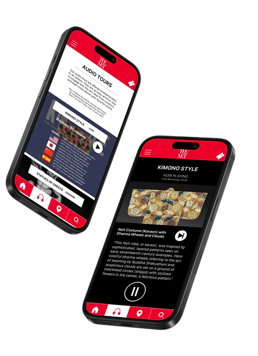
With the basic design of the screens in place, I then created a low-fidelity prototype that has the main user flow: allowing the user to select a tour from those available, see details, play and pause the tour at anytime, and leave a review at the end.
Additional pages were added here for other app features such as a blog, ticket access, a map, and a search function.

Step 3: Usability Studies
With my basic structure and user flow completed, I conducted some quick usability studies with friends and family to uncover insights about what was and was not working.
Some users did not realize that the section titles were clickable and were looking for more obvious button to explore.
3. Animations Delight
Minor animations as you move from screen to screen was a welcome feature that helped it instantly feel more "lux".
Key Findings
1. How to Go Back?
Users were unsure on how to return to a previous page without a back button and felt trapped.
2. Buttons vs Section Titles
With these insights, I was able to go back and make better decisions about button placement, user guidance, and animations to make this product better serve it's purpose.
BEFORE
AFTER


Usability studies helped me find user patterns such as here, where users wanted the ability to not just pause a tour, but end it completely. The stop button of the first design wasn’t clear, thus the “FINISH TOUR NOW” link solution.
Step 4: Refine Design
Now confident in my wireframes, user flow, and usability, I began refining the design into a proper mockup with branding and images.
Within Figma I created components for text styles, graphical elements, buttons, and colors so as to follow a strict style guide and maintain cohesion from screen-to-screen.

Applying these components to my initial wireframes, I now had a high fidelity prototype to refine and polish.


